SCORPS
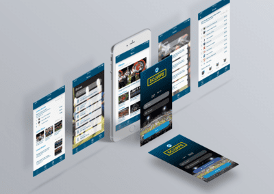
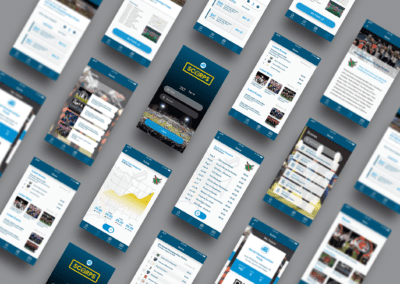
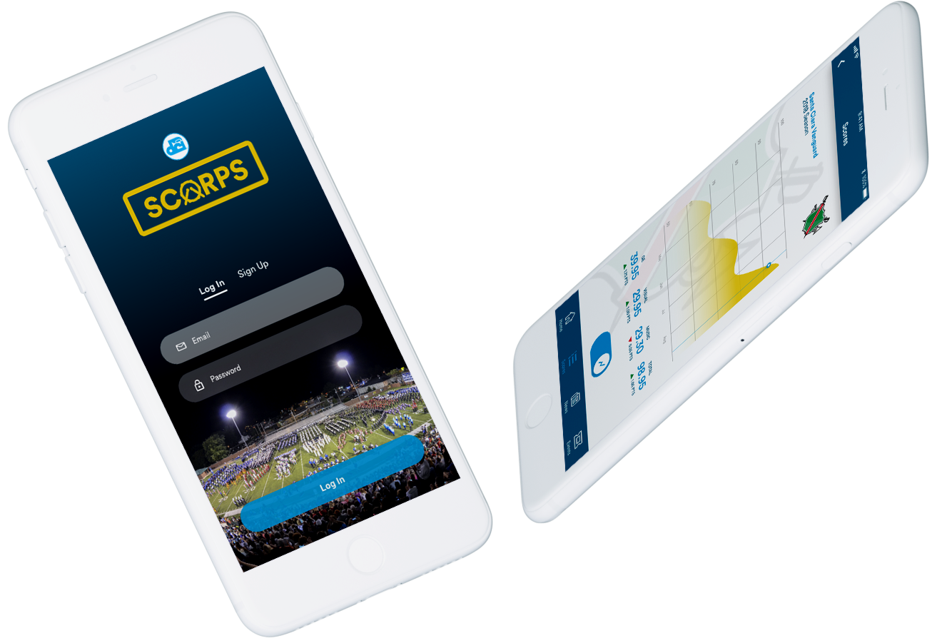
Scorps (pronounced “Scores”) is the only app that all drum corps fans will ever need to keep up with all their news, events and scores.
Background
Drum and bugle corps is a musical competitive sport. It is a visual explosion of color, energy and music put into motion on the football field. This synchronized, artistic ensemble consists of brass instruments large and small, percussion instruments of every variety and a color guard that heightens the visual impact. The activity has developed to a level that is now considered a contemporary art form, and is the second largest youth program in the United States.
Challenges
Fans of the activity have a difficult time keeping up with everything that surrounds the activity, due to the numerous events happening concurrently throughout the country. Fans would like to have easier access to events and be up-to-date on all the latest news and scores. They want to stay engaged, but the info is disjointed.
Tools
Adobe XD, Photoshop, Zeplin
The Design Process
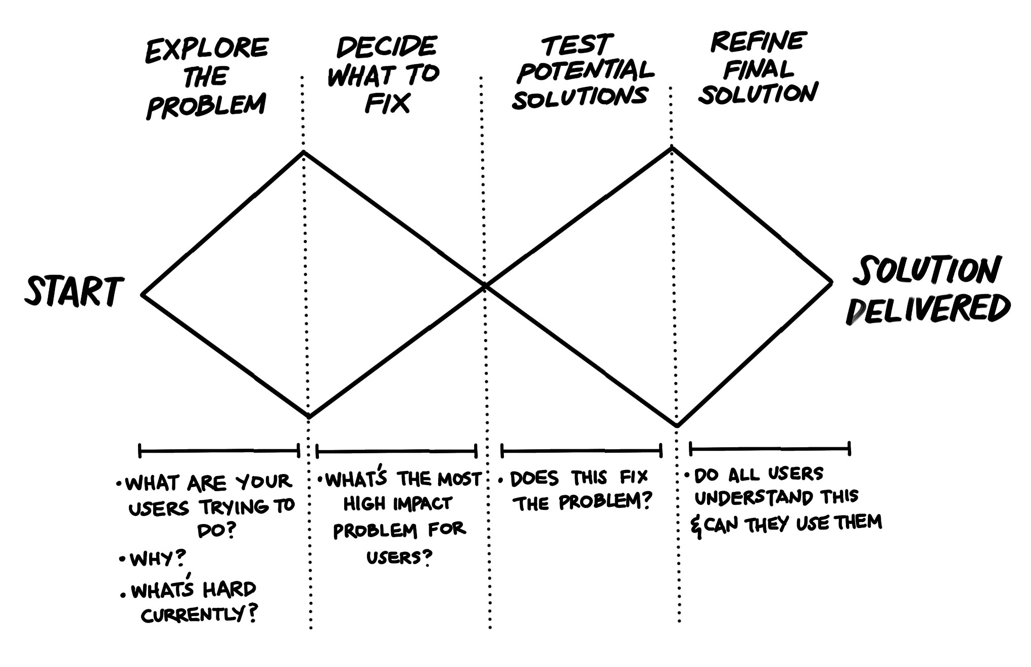
Having a solid UX design process is key to delivering a user-centric solution that is effective and meets both user and business goals. This user experience design process is iterative and allows for continuous improvement to the product.
Research
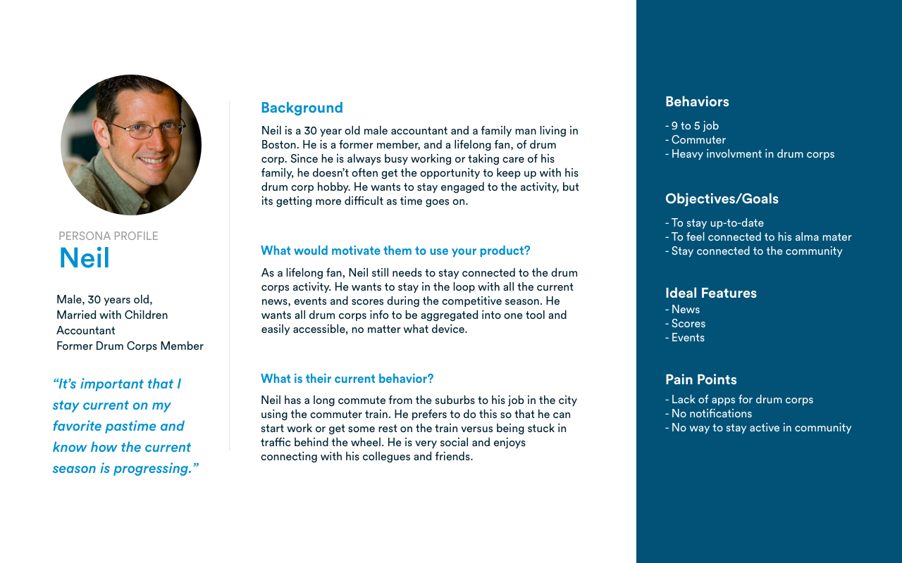
Initial research involved one-to-one interviews with those involved in the drum and bugle corps activity, including members, former members, relatives of members, and fans. The result of the research was manifested into persona profiles to help understand the target user and to assist in designing the best user-centric solution.
Information Architecture and User Flow
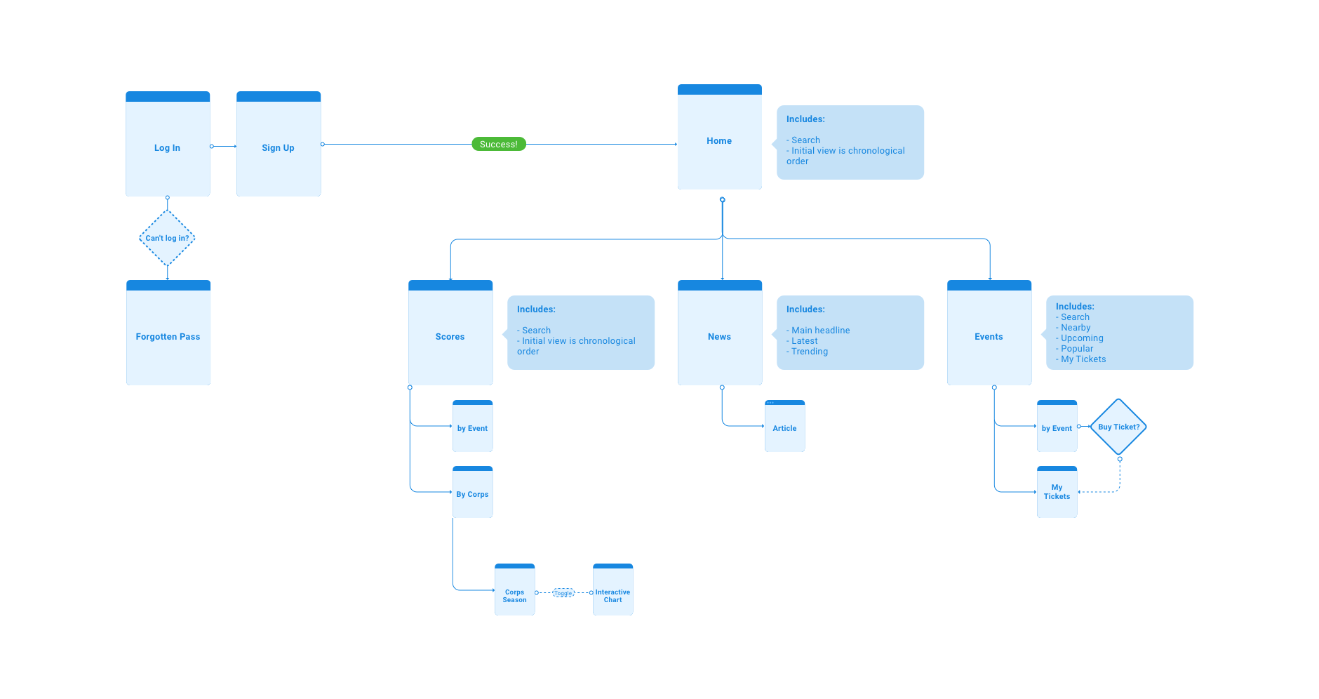
In order to bring organization to the project, the information architecture and user flow was systematically designed for the target users to be able to complete their tasks with ease.
Lo-Fi/Mid-Fi Wireframes and Prototype
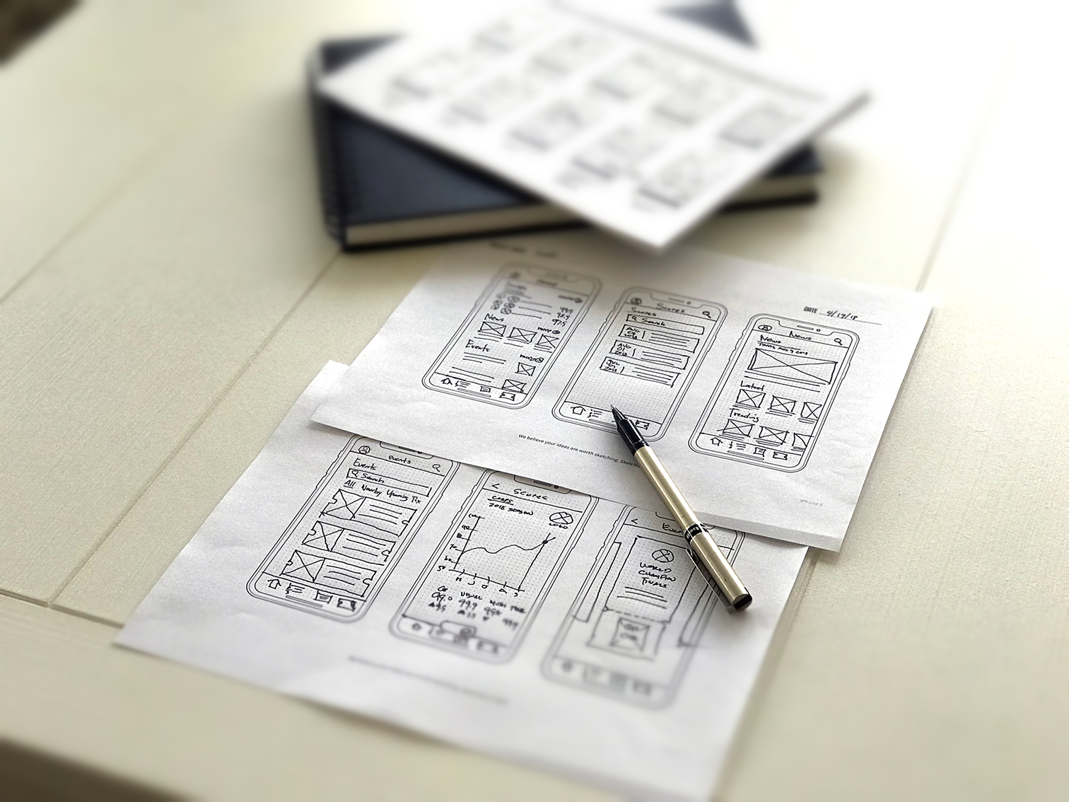
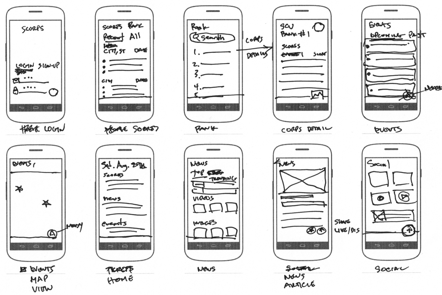
Lo-fidelity drawings were created to get initial brainstorming ideas fleshed-out. Afterwards, rough sketches evolved into digital mid-fi grayscale mockups created using Adobe XD. This allowed me to iterate and refine the screen ideas further. Once the mid-fi digital mockups were created, they were moved to the mobile device as a working test prototype. The draft prototype was presented to a sample of users that fit the target profile and were given tasks to complete within the app. Information was gathered by observing them go through tasks and also solicited feedback. The newly gathered info helped to iterate on the design again before moving on to the hi-fi mockups and prototypes.
Visual Design Language
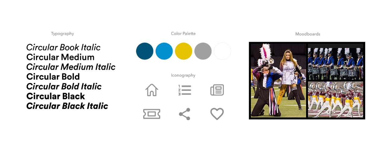
The overall visual design language is highly influenced by the drum corps activity itself. For example, the colors are influenced by the summer evening skies in during which the competitions happen, and the color gold of the championship medals. I avoided the use of many colors in this palette since the imagery of the corps are already extremely vivid and colorful. For typography, the Circular font was chosen because it was a geometric sans-serif and strikes a balance between modern and classic. The icon set selected have simple and clean lines and are a compliment the design. Overall, the chosen visual design language easily speaks to the drum corps demographic.
Hi-Fidelity Mockups and Prototypes
Once the visual design system was defined, the hi-fi mockups were created in order to reflect the design choices for color, layout, typography and iconography. The hi-fi prototype was created in Adobe XD and loaded onto mobile device for further testing.
Designer/Developer Collaboration
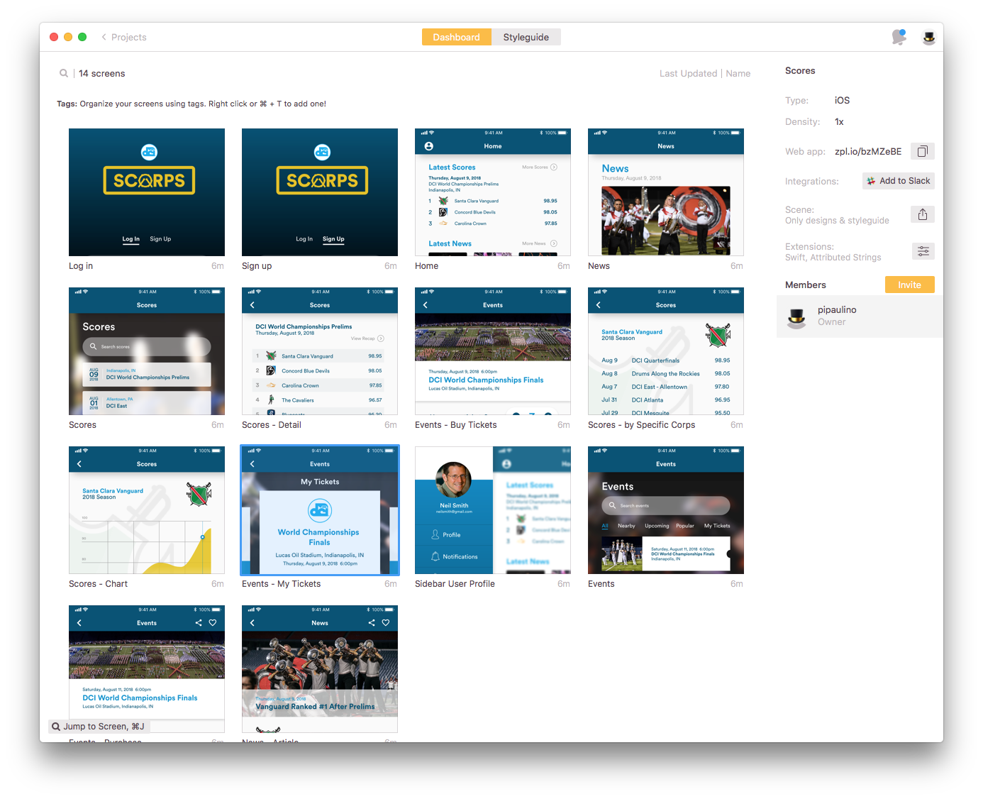
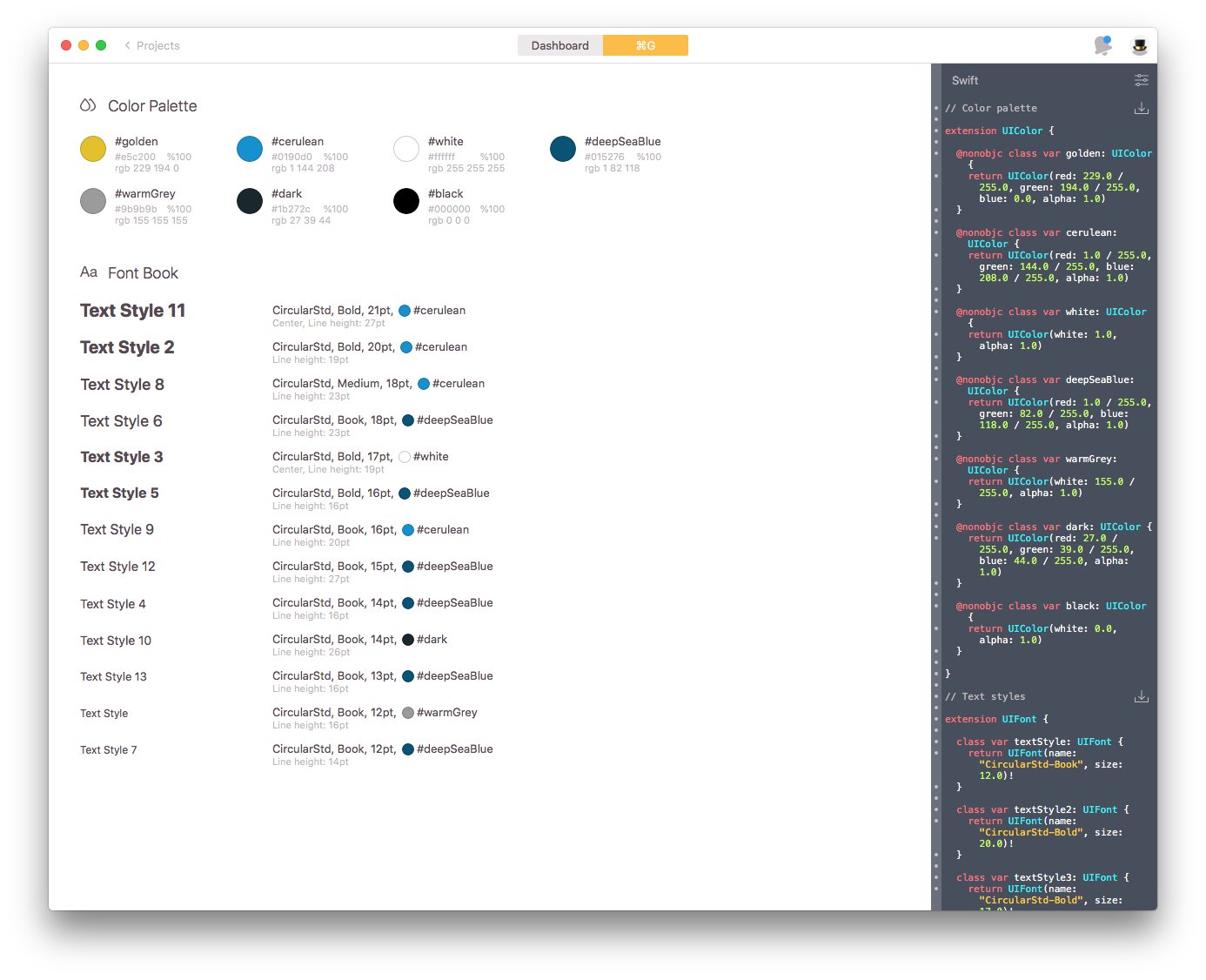
After all remaining issues or feedback was addressed, the design was finalized and sent to developers for coding. In this case, Zeplin was utilized to help speed up workflow, increase productivity and reduce the back and forth between designers and developers.

