Digital Storm
A redesign of product pages for the Digital Storm ecommerce website
Background
Digital Storm is a computer system manufacturer which specializes in custom high-performance gaming desktop and laptop computers.
Tools
Sketch, InVision, Photoshop, Illustrator
Challenges
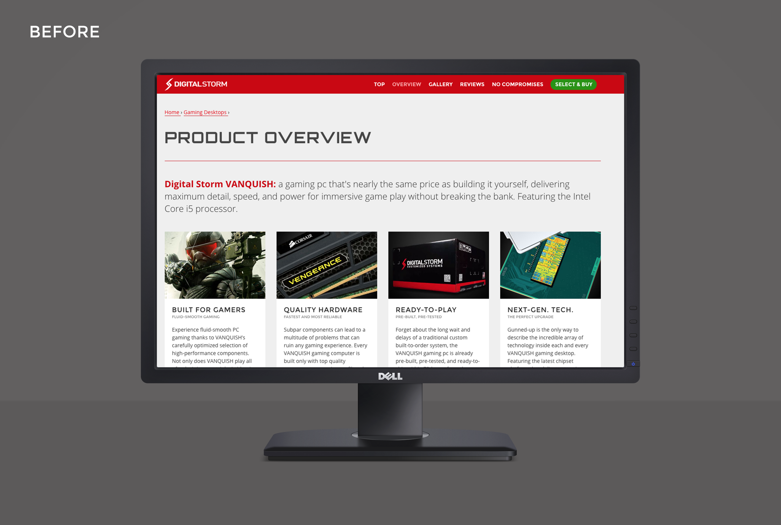
I was brought into this project to redesign and modernize all existing product pages to better align with new branding and marketing strategies. The existing website were looking dated and a refresh was necessary in order to attract new customers and retain existing ones. New competition in the custom gaming system industry increased and Digital Storm needed to stand out as the premier choice for hardcore PC gamers.
The Design Process
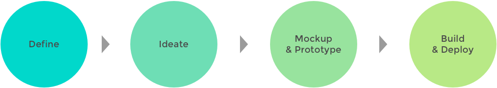
To stay within the tight timeline, it was necessary for me to streamline the design process carefully. I created a milestone schedule which included research for target users and SWOT analysis. From the findings, I was able to move quickly through the ideation and design phases before delivery of the final designs to the developers.
Research
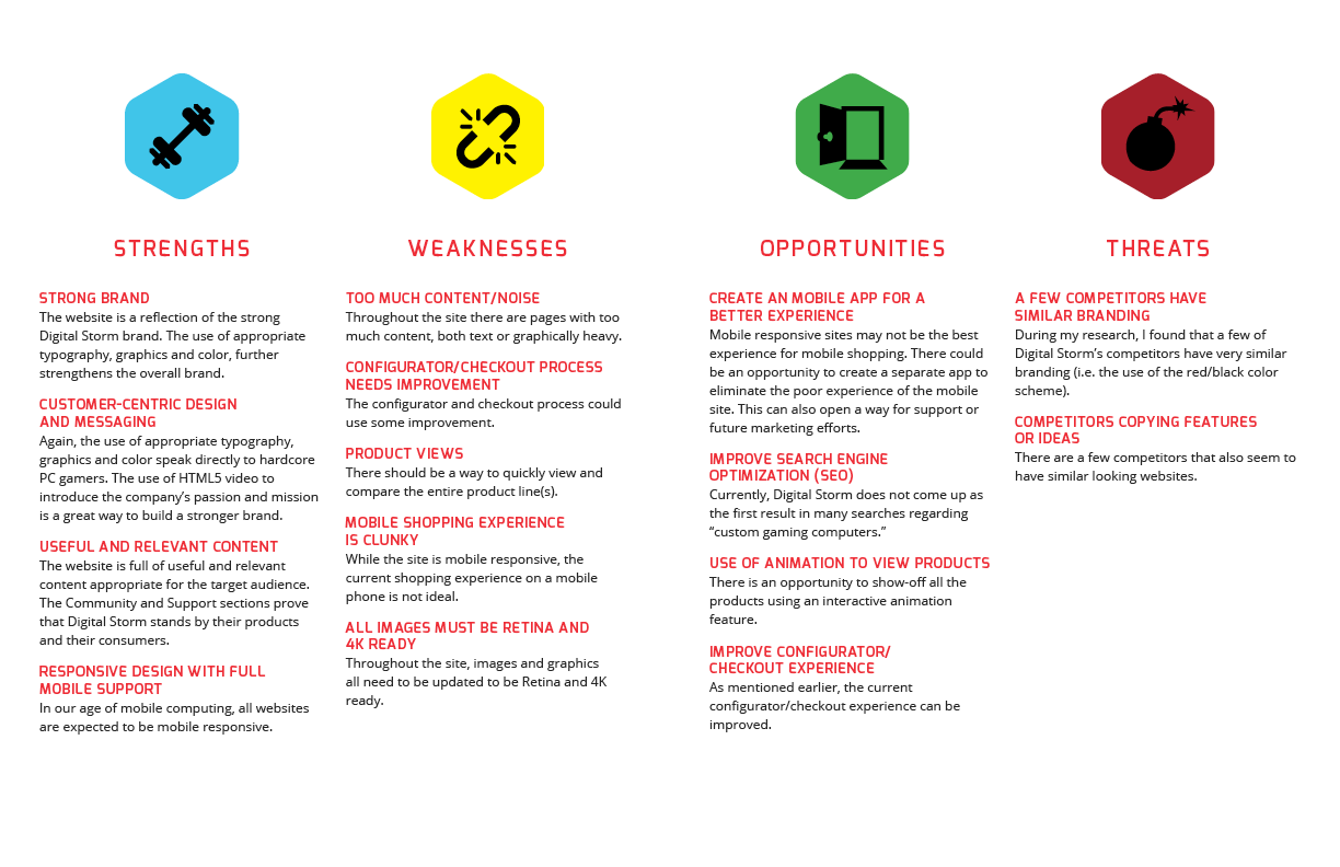
Initial research involved conversations with the Digital Storm leadership in order for me to learn more about the company, their brand, the industry, its customers and any current issues, problems and/or business goals. After further research, I was able to gather enough information to create a SWOT analysis and persona profile sheets.
The SWOT analysis allowed me a clear picture of both internal (strengths, weakness) and external (opportunities, threats) factors that I could use to influence the design.
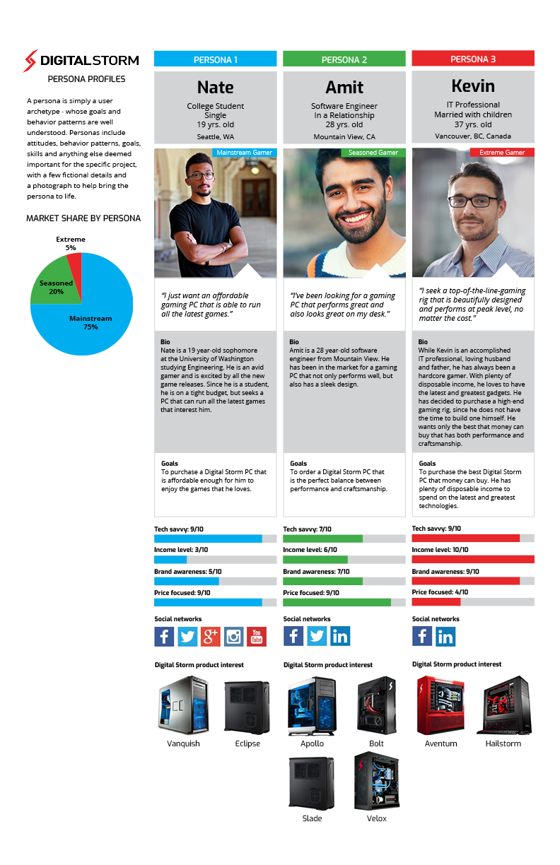
In addition, the user persona profiles provided me a very clear perspective of which personas matched which specific gaming systems in the product line.
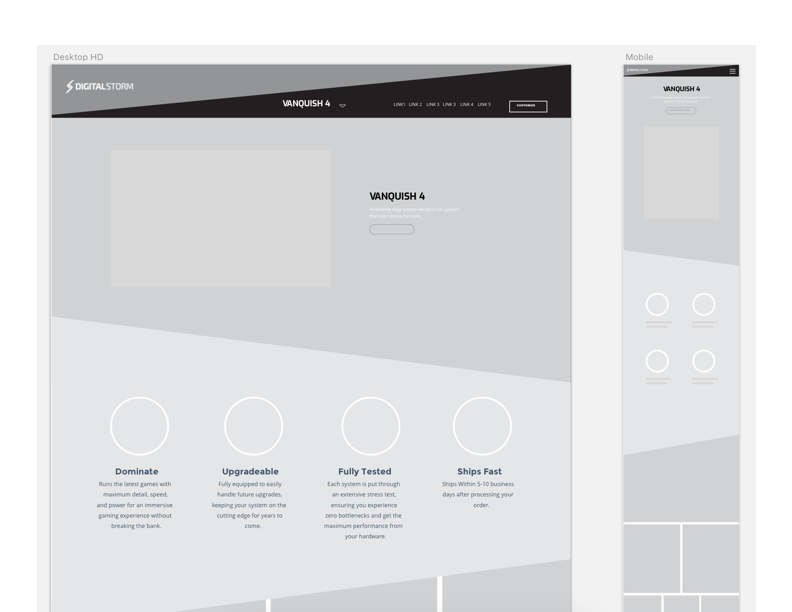
Lo-Fi/Mid-Fi Wireframes and Prototype
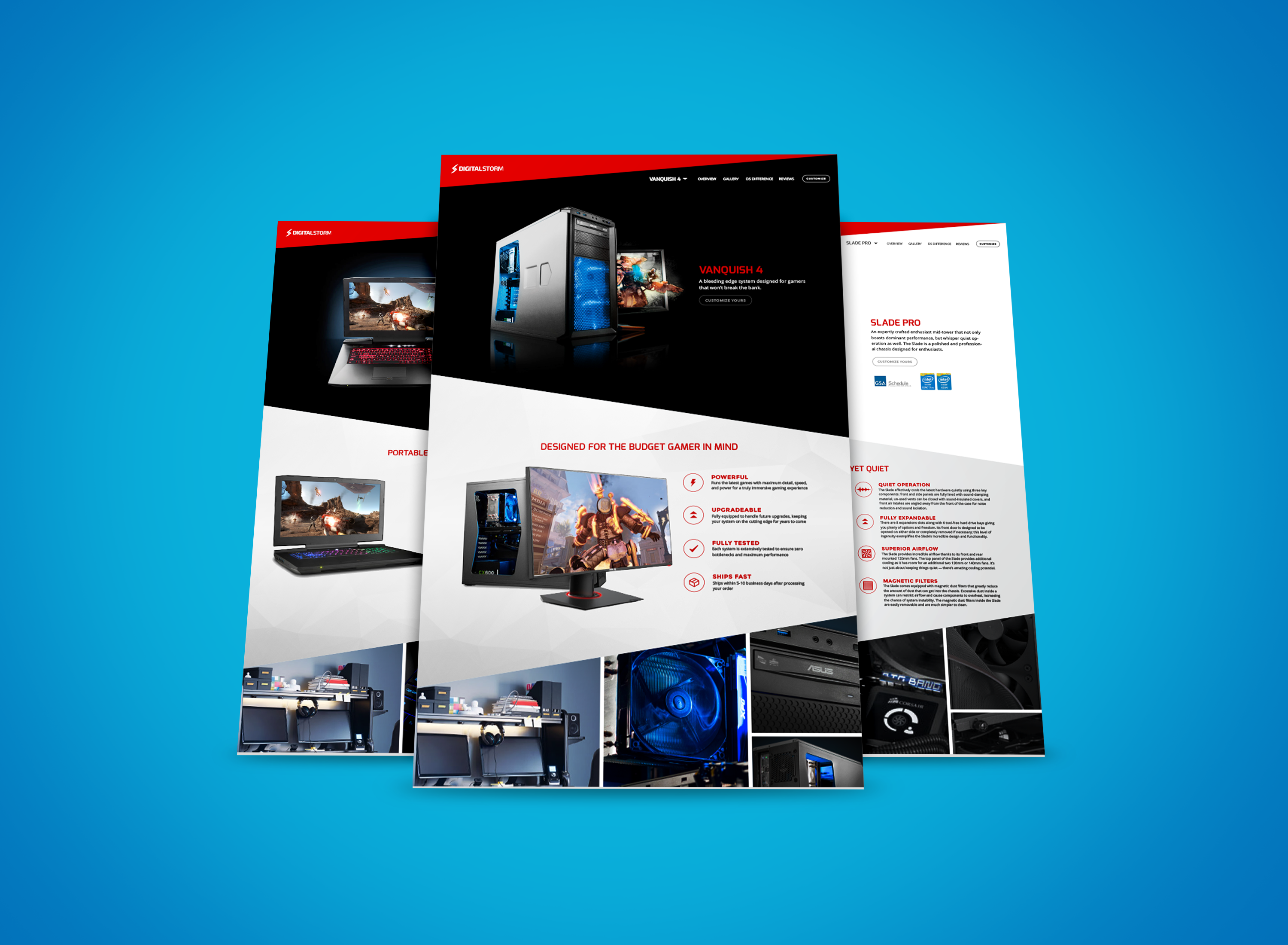
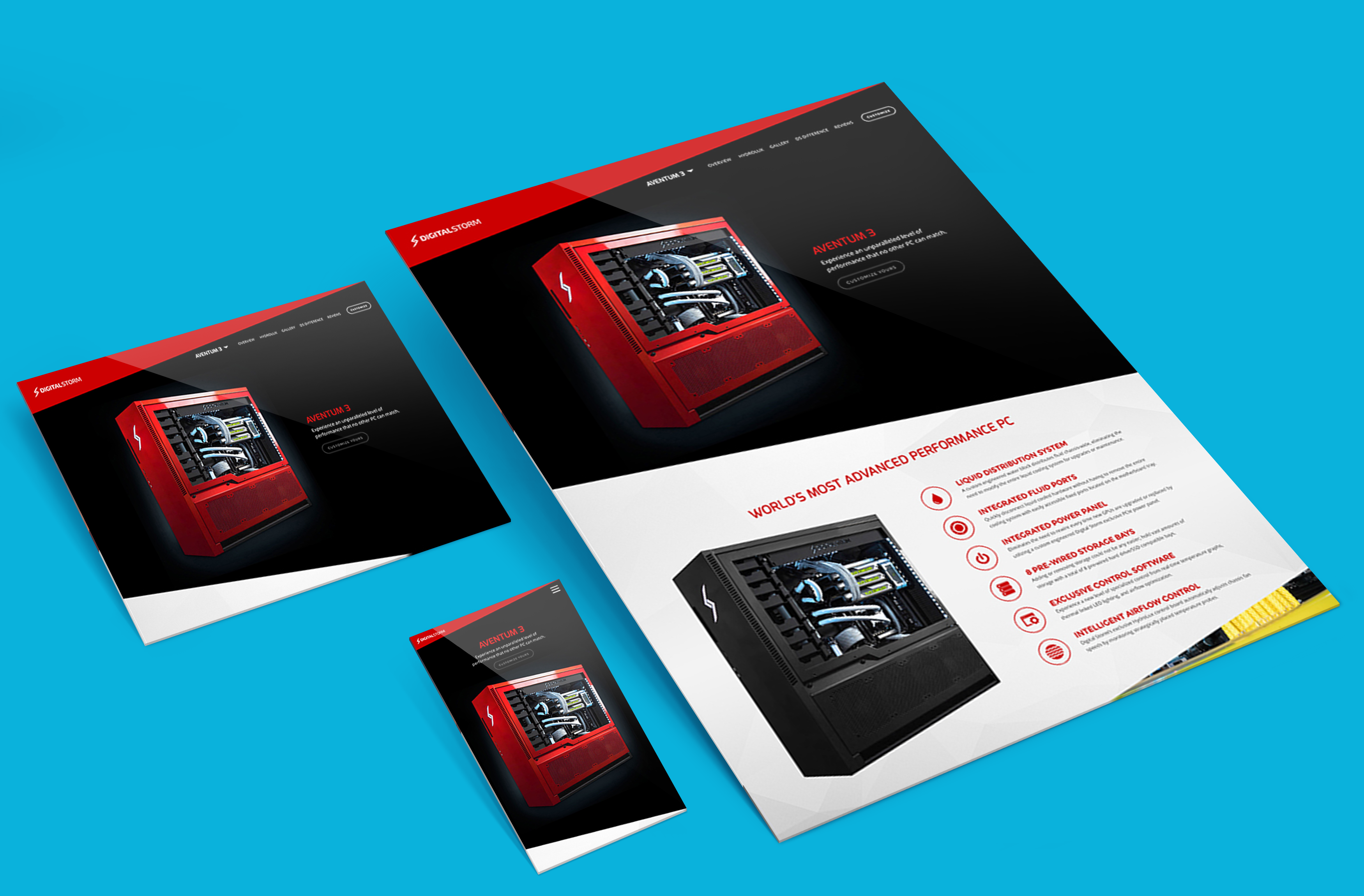
In order to achieve sales conversions, it was important that the layout of the product pages allowed for easy consumption of all information on the page. From the top, I structured the pages systematically so that it allowed for a product story to be told. I also broke the page up into sections for easier digestion as the user went through the journey down the page.
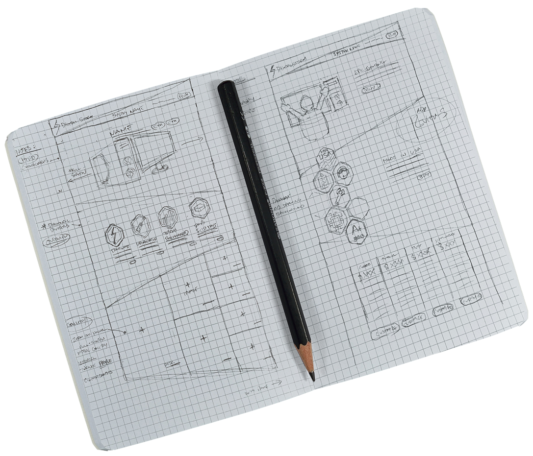
My initial sketches allowed me to be able to get my first ideas out before moving on to digital wireframes for further refinement. This allowed me to present my ideas clearly to the leadership and apply all their feedback to another design iteration.
Visual Design Language
The main influence in the Digital Storm visual design language was the actually products themselves. They were beautifully crafted and detailed and had clean lines and beautiful color.
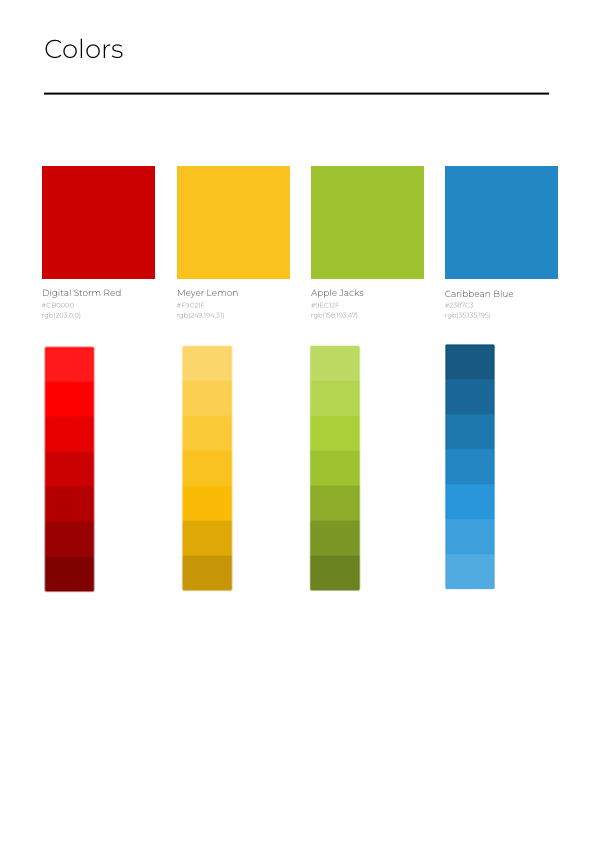
The Digital Storm Red remained as the main color in order to support the current brand, but added a few more primary colors to be used as accents. Shades of gray were added in order to bring the colorful imagery of the products to the forefront.
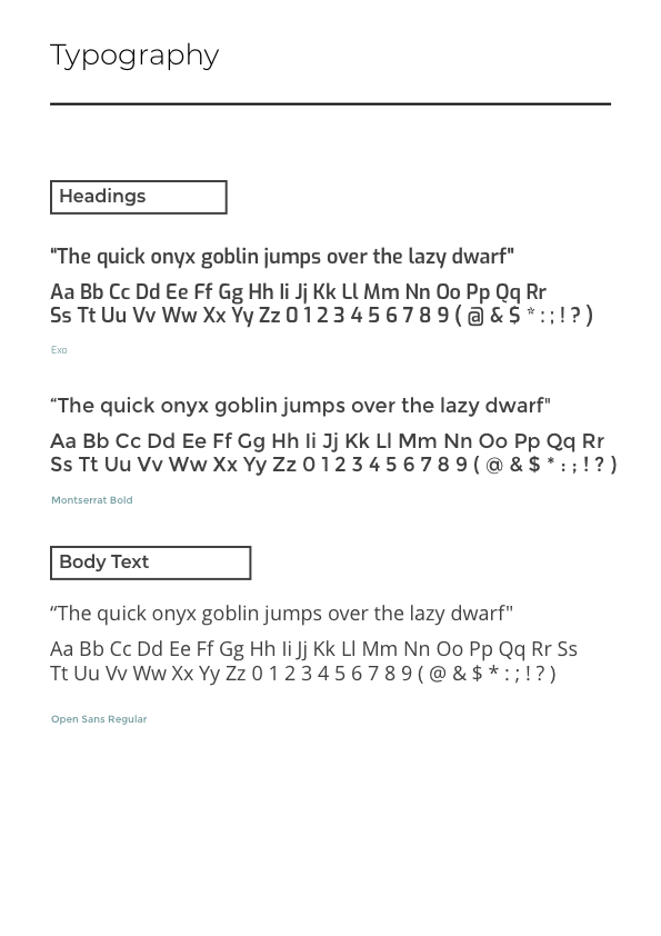
For the typography, I used the combination of Exo and Montserrat for headings and Open Sans for body text. Exo is a contemporary geometric sans serif typeface conveys a technological and futuristic feeling while keeping an elegant design. It was also used in the logo, so it was a great fit to reinforce the brand. In addition, Montserrat was chosen for its geometric simplicity of its letterform, while Open Sans was selected for its excellent legibility on web, and mobile interfaces.
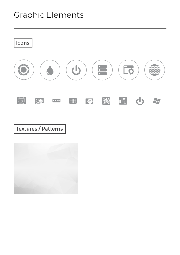
By adding a iconography set that was modern and simple, it helped to reflect and strengthen Digital Storm’s brand identity.
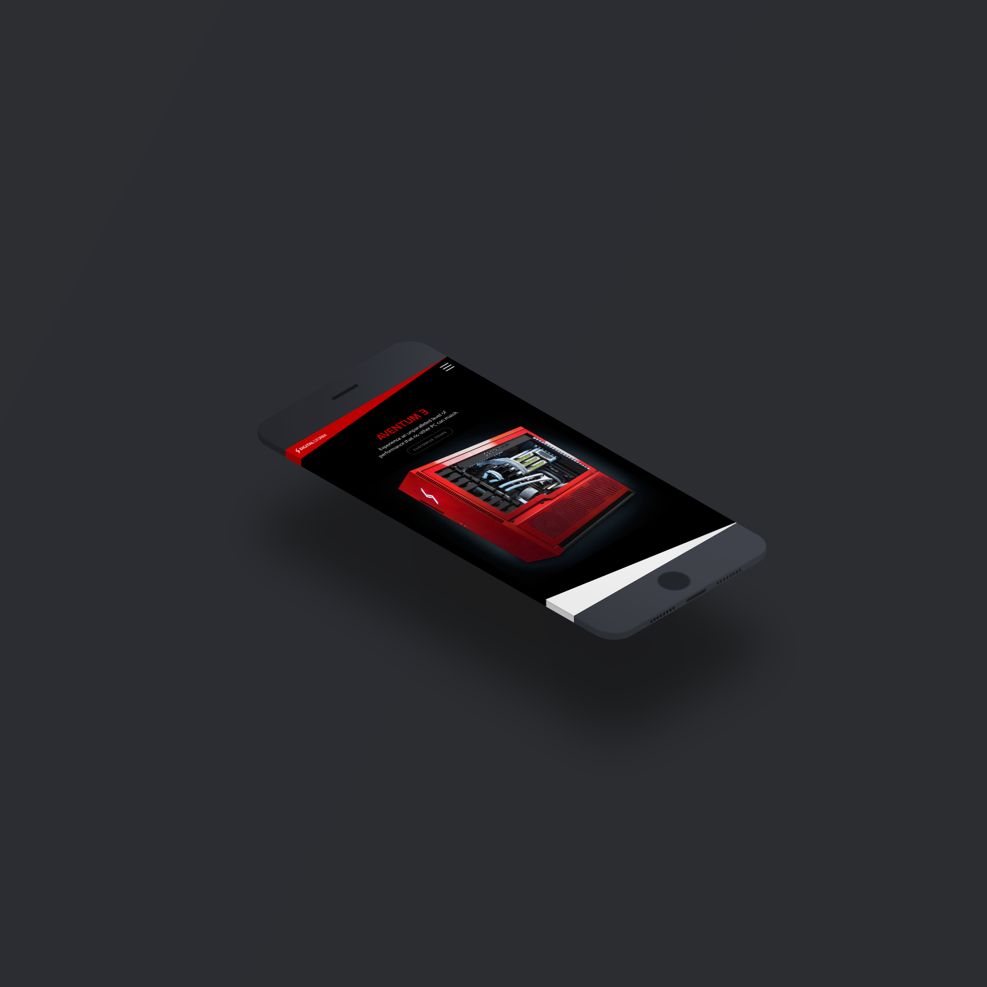
Hi-Fidelity Mockups and Prototypes
Once the visual design system was finalized, the hi-fi mockups were created in order to reflect the design choices for color, layout, typography and iconography.
The hi-fi prototype was created in Sketch and presented to leadership and the developers for final feedback.